Table of contents
In 2010, on Hacker News, a popular social news site run by Y Combinator, someone started a discussion with a question that today seems tailor-made for the age of artificial intelligence: why do all start-up websites look the same?
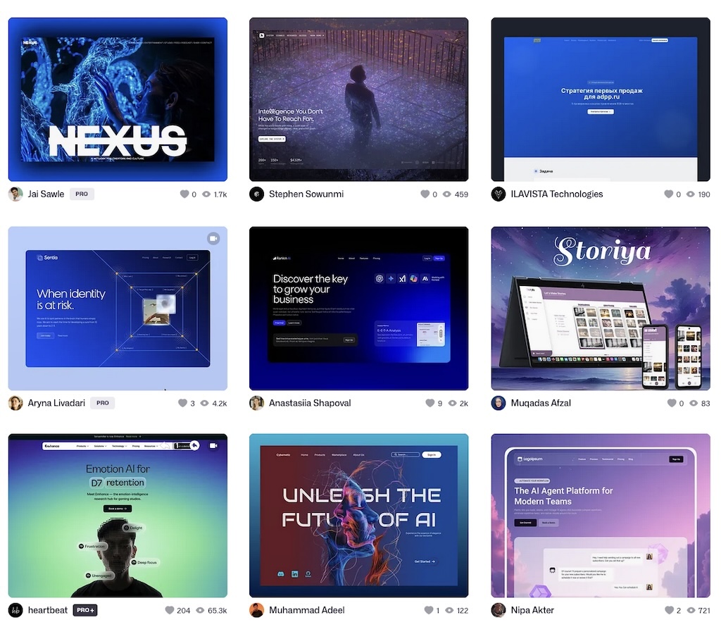
The list of similarities was precise: lots of white, a dominant colour – usually blue, green or dark grey – light grey gradients, thin one-pixel borders, large rectangular buttons with rounded corners, sans serif fonts everywhere, footers full of secondary links, and so on. There was no Midjourney, DALL·E, Framer AI or automated brand identity generators back then. There were no landing pages created in seconds from a prompt using Tailwind CSS. There were no logos generated by models trained on millions of existing designs.
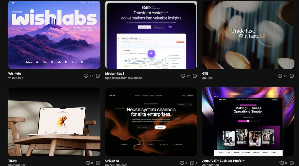
Yet the diagnosis was already there, so it wasn’t artificial intelligence that led to the homogenisation of start-ups’ visual identities. It did, however, make the process faster, cheaper, more accessible and more radical. Underlying this is the tendency for start-ups (and companies in general) to resemble one another visually, as they all seek to conform to the same image of success. “The risk isn’t so much using artificial intelligence to design a website or a visual identity, but rather using it before having established the visual identity the company wishes to project and what makes that brand different,” observes Lorenzo Sala, CEO of Alkimedia, a web agency specialising in the creation of corporate websites. “If the brief, the prompt, is generic, the AI will tend to produce a credible result but one based on the average of what it knows: correct, neat, pleasant, but not very memorable. To stand out, a start-up must approach the tools with a clear vision, not expect the tools to create it for them.” “In 2010, the archetype was the ideal web app: clean, white, legible, reassuring, with a clearly visible button and a simple promise. Today, the archetype is the artificial intelligence or SaaS start-up: dark background, blue-violet glow, luminous orb, dashboards suspended in mid-air, geometric icons, premium sans-serif fonts, micro-animations, grids, lines, nodes, abstract interfaces that suggest intelligence, automation and control.” They are different aesthetics, but the mechanism is the same. Every era has its own way of making a start-up look cool and, above all, fundable.
Sameness does not mean ugly
When it comes to AI and visual imagery, the most immediate criticism is often that of mediocrity: generic output, soulless images, stock logos, interchangeable illustrations, and texts full of empty words.
It is an understandable criticism, but a weak one, because AI does not produce inferior visual identities; on the contrary, they are very well-focused, professional, elegant, and immediately recognisable as ‘start-ups’ – potential unicorns. AI does not level down, but rather levels up, towards the aspirational.
This is an aspect that could open the door to philosophical reflections, namely the convergence towards a shared form (and representation) of desirability or success. But looking at the practical side of things, it is obvious that all start-ups try to look like the ideal start-up, imitating the same archetype: clean, scalable, premium, technical, trustworthy, slightly futuristic. It must appear young but not immature, ambitious but not naïve, tech-savvy but not cold, enterprise-ready but not corporate, innovative but not incomprehensible.
All these features can be included in a prompt, with a few ‘Stripe-style’ references.
The results are never bad; they’re generally very good. But it’s a fake kind of beauty – the intersection between the image of success that start-ups have internalised and the visual patterns that AI has learnt to recognise as credible.
The start-up as a visual category
Every sector develops its own codes. A bank cannot afford to look like a music festival. A skincare brand does not want to look like a DevOps platform. An insurance company does not communicate like a streetwear brand. Even start-ups have their own visual language. For a long time, in the early days of the web, that language was characterised by a total lack of style; then, at a certain point, it began to evolve towards a distinct ‘start-up style’. In Web 2.0, this meant using white space, subtle gradients, rounded buttons, user-friendly interfaces, an approachable tone, and a ‘human’ aesthetic – in contrast to the cluttered, impersonal corporate portals of previous years. Then came the era of flat design, vector illustrations, faceless figures, pastel colour palettes, and disproportionate characters working on giant interfaces. There too, an aesthetic designed to appear simple, inclusive and friendly quickly became the industry standard.
“Today, with AI, the rules have shifted once again,” adds Sala. “White has given way to black. Glossy buttons have become minimalist pills. Vector mascots have been replaced by glowing spheres, neural networks, purple-blue gradients, abstract symbols, mock-ups of dashboards, glows, particles, curved lines and glassy surfaces. The underlying message is always the same: we’re modern, we’re competent, we’re scalable, we’re cool, we’re the future.”
From conversion to plausibility
In the 2010 Hacker News thread mentioned at the start, many comments explained the similarity in terms of functional reasons: A/B testing, click tracking, analytics, readability, familiarity, calls to action, and fear of the back button. If a particular layout converts better, if a coloured button increases sign-ups, if a more readable site reduces bounce rates, then aesthetic convergence becomes almost inevitable.
This explanation is always valid, but it is not enough. For a start-up in the seed phase – which has yet to generate revenue or build a reputation, and sometimes doesn’t even have a product – the website is not just a means of communication; at times, it is the only tangible proof of its existence. Consequently, the visual identity is not intended to convert users but to convey a sense of substance, to instil credibility and build trust. Plausibility for investors, for recruiting staff, for the media, and for the market. Therefore, a landing page must do much more than simply explain the product. “Indeed, from the perspective of a start-up in the ideation or validation phase, generative AI solves a real problem of limited budget: professional design is usually expensive and time-consuming, and it also requires an aesthetic judgement that most founders lack,” continues Lorenzo Sala. “It is no coincidence that the market for AI-based design is booming.” “What AI cannot do is produce a truly original design; it has learnt from existing patterns. It doesn’t copy from a single brand or a single website: it copies the way an entire category represents its own success.”
Average taste becomes the default
Generative models can produce something different. In most cases, however, they produce recognisability.
They determine what looks professional, what looks stylish, what looks like a sound investment, and what looks out of place. And the more it is used, the more it becomes entrenched, partly due to ‘vibe coding’ (that is, the new way of ‘programming’ in which an AI system is guided using natural language, and this generates the code for an app, a website, a web page, etc.)
Wheels Up Collective has dubbed this phenomenon the ‘beigeification’ of the web: not an ugly design, but a boring, redundant one – albeit statistically plausible. And when a website immediately appears clean, functional and professional enough, the user has little reason to question it. It is the ‘good enough’ trap that one falls into if one is not a professional web design expert. The website looks ready, so it’s published, but it isn’t necessarily distinctive. “Mind you, not all instances of similarity are a mistake,” emphasises Sala. “Conventions exist for a reason: a website must be legible, a call to action must be recognisable, and a complex product must be explained simply.” When investors recognise certain visual cues as markers of a ‘credible start-up’, deviating from that norm can become a risk. A website that’s too original may appear unprofessional, or worse, unaware of industry conventions. At the same time, mimicking the style of a successful start-up – perhaps even one in the same sector – immediately gives the impression of being a copycat. How do you strike the right balance?
How to stop your website from looking like just any old start-up
Communication is generally underestimated by all companies; start-ups tend to do as much as possible in-house. Furthermore, they are generally made up of tech-savvy and smart people, so the result is that they fail to consult industry professionals and instead invest their budget in subscriptions to tools that they may never use again but which, at the time, seem like the answer to their problems. Let’s pause for a moment to consider how and when to use these tools. Those who end up with a recognisable website using AI have usually already answered a few questions before opening any tool: who exactly am I targeting, what sets me apart from others doing the same thing, and how do I want to be perceived? Those who, on the other hand, start by falling in love with a template and build their identity around it end up, at best, with a run-of-the-mill website with their own logo on top. So, here are three practical questions to ask yourself if you intend to create your start-up’s website using an AI tool:
- Firstly: did I give the model something of my own, or just general instructions? A prompt such as ‘modern website for an AI start-up’ returns exactly what it describes: a modern website for any AI start-up. Specific visual references, examples of communication that work in your sector, guidance on what to avoid at all costs: all of these produce different results. Generic in, generic out.
- Firstly: would someone unfamiliar with the company be able to work out what it does in ten seconds? This isn’t a question about design but about the clarity of the positioning — and that’s the crucial one, because design can amplify a clear positioning, not invent one from scratch. If the answer isn’t already in your head before you open the tool, no prompt will make it appear.
- After generating it: could the website belong to a competitor? This is the test, not a preliminary question. If, when you look at the result, the answer is ‘yes’, or even just ‘maybe’, it’s not a problem with the prompt: it’s proof that the first two questions didn’t really have a solid answer, and the tool has simply made that clear.
“One final, practical piece of advice for those who really want to do it themselves? Use AI to generate variations, not to choose the direction.”
AI can generate alternatives, explore new avenues and speed up prototyping. But the overall direction must remain a human responsibility: deciding what to keep, what to discard, what to highlight and what to refine. If anyone can create a professional-looking webpage in a matter of minutes, the value no longer lies simply in having a beautiful website, but in having a website that is unique to your start-up. (cover photo by Hal Gatewood on Unsplash)
ALL RIGHTS RESERVED ©